


Elementor flexbox columns
1.Introduction
Imagine this: You’re building a stunning website in Elementor, and your vision includes an intricate multi-column layout. You meticulously adjust column widths, add spacing, and try to make everything look perfect on different screen sizes. But as you tweak one thing, something else breaks. The layout becomes a frustrating puzzle, and your design dreams start to feel limited by the constraints of traditional Elementor columns.
Sound familiar? If so, you’re not alone. Many designers have encountered the challenges of creating complex layouts using Elementor’s standard column structure. The limitations become evident when dealing with:
- Unequal column heights: Content doesn’t always align neatly, leading to awkward gaps.
- Complex arrangements: Achieving intricate patterns like overlapping or zigzag columns can be a nightmare.
- Responsiveness: Making everything look good across various devices often involves endless adjustments.
Table of Contents
2. Understanding Flexbox: The Foundation for Responsive Elementor Columns
Flexbox is a powerful CSS layout model designed to make arranging items within a container (like Elementor columns) incredibly flexible and easy. By mastering a few key concepts, you can unlock a world of design possibilities.
What is Flexbox?
Flexbox, short for “Flexible Box Layout,” is a one-dimensional layout model. It allows you to control the direction, alignment, and spacing of items within a container, even when the size of those items is unknown or dynamic. This makes it a perfect tool for creating responsive designs that adapt to different screen sizes.
Key Flexbox Concepts
- Flex Container: The parent element that holds the flex items. In Elementor, your section or column acts as the flex container.
- Flex Items: The individual elements within the flex container (e.g., text blocks, images, buttons).
- Main Axis: The primary direction in which flex items are laid out (either horizontal or vertical).
- Cross Axis: The perpendicular direction to the main axis.
- Flex Direction: Determines whether items are arranged in a row (horizontal) or a column (vertical).
- Justify Content: Controls the alignment of items along the main axis.
- Align Items: Controls the alignment of items along the cross axis.
Benefits of Flexbox for Elementor Column Design
Flexbox offers several advantages for creating layouts in Elementor:
- Flexibility: Easily rearrange and resize Elementor columns to fit different screen sizes and content.
- Responsiveness: Create designs that adapt seamlessly to various devices, ensuring a consistent user experience.
- Simplified Alignment: Effortlessly center content, distribute space evenly, or align items to the edges of columns.
- Efficient Use of Space: Automatically adjust item sizes to maximize space utilization within a column.
- Intuitive Syntax: Flexbox properties are relatively easy to understand and apply compared to older layout methods.
Elementor and Flexbox

Elementor seamlessly integrates Flexbox into its core functionality, giving you full control over the arrangement of items within your columns. You can access Flexbox settings directly from the Elementor editor, allowing you to customize column layouts without writing any code.
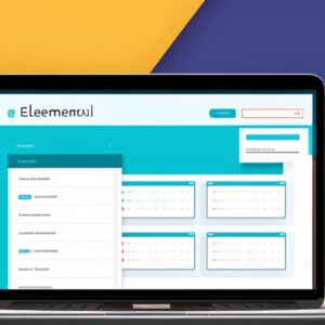
3. Elementor Flexbox Columns: Getting Started
Elementor Flexbox columns offer greater flexibility and control compared to the traditional section/column structure. Here’s how to get started:
Enabling Flexbox:
- Navigate to Elementor Settings: In your WordPress dashboard, go to Elementor > Settings.
- Open the Experiments Tab: Click on the “Experiments” tab.
- Activate Flexbox Container: Find the “Flexbox Container” experiment and select “Active” from the dropdown menu.
- Save Changes: Don’t forget to click “Save Changes” at the bottom.
Creating Flexbox Columns:
- Add a Container: Instead of adding a section, click the “+” icon in the Elementor editor and choose “Container.”
- Add Widgets: Drag and drop widgets directly into the container, just like you would with a column.
- Divide into Columns: To create multiple columns, click on the container’s handle and select “Edit Container.” Then, under the “Layout” tab, adjust the number of columns.
Flexbox Column Settings:
Elementor Flexbox columns offer powerful settings to control their layout behavior:
- Flex-Grow: Determines how much a column should grow relative to other columns when there’s extra space available.
- Flex-Shrink: Determines how much a column should shrink relative to other columns when there’s not enough space.
- Flex-Basis: Sets the initial size of a column before any growing or shrinking takes place.
- Order: Controls the order in which columns appear within the container.
- Align-Self: Allows you to align individual columns differently within the container.
Tips for Using Elementor Flexbox Columns:
- Experiment: Play around with the Flexbox column settings to understand how they interact and affect the layout.
- Responsive Design: Use different settings for different screen sizes to ensure your layouts look great on all devices.
- Nested Containers: You can even nest containers within containers to create more complex layouts.
4: Mastering Flexbox Columns in Elementor
Elementor’s Flexbox containers offer a powerful way to create highly adaptable and complex column layouts. Let’s dive into some advanced techniques to harness their full potential:
Responsive Layouts with Elementor Flexbox Columns
- The Power of Flexbox: Explain how Flexbox’s flexible nature allows columns to automatically adjust their size and position based on screen width, eliminating the need for multiple fixed-width column setups.
- Responsive Column Widths: Demonstrate how to set column widths using percentages or fractions (“fr” units) to ensure they proportionally scale on different devices.
- Order Property: Show how to change the order of columns on smaller screens to optimize content flow for mobile users.
- Wrap Property: Discuss using the “wrap” property to allow columns to wrap onto multiple lines when the screen becomes too narrow.
- Keywords: “Elementor columns,” “flexbox,” “Elementor flexbox columns,” “responsive design”
Complex Column Structures with Nested Flexbox Containers
- Nested Containers: Explain how to create complex layouts by embedding Flexbox containers within other Flexbox containers.
- Visual Hierarchy: Use nested containers to establish clear visual hierarchies within your content.
- Design Flexibility: Show how this approach allows for more intricate and visually engaging designs than simple column grids.
- Keywords: “Elementor columns,” “flexbox,” “Elementor flexbox columns”
Advanced Alignment & Distribution in Elementor
- Justify-Content: Explain how this property controls the horizontal alignment of column elements (e.g., space-between, center, space-around).
- Align-Items: Demonstrate how to control the vertical alignment of items within each column (e.g., flex-start, center, flex-end).
- Align-Content: Show how this property is used to align multiple lines of wrapped content within a container.
- Flex-Grow and Flex-Shrink: Discuss how to control how columns grow or shrink to fill available space.
- Gap Property: Explain how to easily add spacing between Flexbox items with the “gap” property.
Key Takeaways:
- Emphasize the flexibility and responsiveness of Elementor Flexbox columns for creating layouts that adapt beautifully to any device.
- Highlight the ability to create complex and visually appealing designs using nested containers.
- Show how to use Flexbox properties to precisely control the alignment and spacing of column elements.
5.Real-World Examples: Elementor Flexbox in Action
Elementor’s Flexbox columns have revolutionized how we design and structure websites, offering unparalleled flexibility and responsiveness. Let’s dive into some real-world examples to see how this powerful tool has been leveraged to create visually appealing and functional layouts:
Showcase: Inspiring Layouts with Elementor Flexbox Columns
- Dynamic Homepage Hero: Imagine a homepage hero section with captivating visuals and text seamlessly arranged using Flexbox columns. This allows for easy adjustment of content placement, ensuring optimal viewing on all devices.
- Feature-Rich Product Showcase: Flexbox columns excel at presenting product features in a visually organized manner. Each column can highlight a specific aspect, accompanied by images or icons, making it easy for users to digest information.
- Testimonials with Impact: Displaying customer testimonials in a visually engaging way can significantly boost credibility. Flexbox columns allow you to create a visually appealing layout where each testimonial stands out while maintaining a cohesive overall design.
- Interactive Pricing Tables: Pricing tables are crucial for businesses offering multiple tiers of services. With Elementor Flexbox columns, you can create dynamic pricing tables that clearly showcase each plan’s features and benefits in an organized and easily comparable format.
- Engaging Blog Layouts: Traditional blog layouts can be transformed with Elementor Flexbox columns. You can create a multi-column structure for featured posts, recent articles, or category highlights, making your blog page more visually appealing and encouraging user engagement.
Case Studies: Solving Design Challenges with Elementor Flexbox Columns
- Challenge: A client needed a website layout that could accommodate a wide range of content types, from text-heavy articles to image galleries.
- Solution: Elementor Flexbox columns were used to create a modular design where different content sections could be easily rearranged and resized, ensuring a consistent look and feel across the site.
- Challenge: A small business wanted to showcase its team members in a visually appealing way.
- Solution: Flexbox columns were used to create a grid layout where each team member’s profile was displayed in its own column, with images, bios, and social media links.
Templates: Your Starting Point for Flexbox Creativity
To get you started, Elementor offers a plethora of pre-designed templates that leverage the power of Flexbox columns. These templates can be easily customized to fit your specific needs, saving you time and effort while ensuring a professional and polished look.
Why Flexbox Matters in Elementor
Elementor Flexbox columns provide:
- Responsiveness: Designs adapt effortlessly to various screen sizes, guaranteeing a seamless user experience across devices.
- Flexibility: Easily arrange and realign content elements to create unique and dynamic layouts.
- Efficiency: Streamline your design process with intuitive controls and pre-built templates.
- Creativity: Unlock your imagination and design websites that stand out from the crowd.
Elevate Your Designs with Elementor Flexbox
Elementor Flexbox columns are a game-changer for web designers and developers. They empower you to create visually stunning, highly functional, and responsive websites that captivate your audience and leave a lasting impression.
6.Tips, Tricks & Best Practices for Elementor Flexbox Columns
Elementor’s Flexbox columns offer unparalleled flexibility and control over your website layout design. However, to make the most of this powerful feature, it’s crucial to understand some essential tips, tricks, and best practices. Let’s dive in:
1. Master the Flexbox Properties
Flexbox operates with a unique set of properties that govern how items are arranged and aligned within a container. Key properties to familiarize yourself with include:
- flex-direction: Determines the main axis along which items are laid out (row or column).
- flex-wrap: Controls whether items wrap onto multiple lines if they don’t fit on a single line.
- justify-content: Aligns items along the main axis.
- align-items: Aligns items along the cross axis.
- align-content: Distributes space between lines when items wrap onto multiple lines.
Experimenting with these properties will allow you to create a wide variety of layouts with Elementor Flexbox columns.
2. Prioritize Mobile-First Design
When designing with Flexbox, always consider mobile devices first. Start by creating a layout that works well on smaller screens, then use media queries to adjust styles as the screen size increases. This approach ensures a consistent and optimal user experience across all devices.
3. Leverage Elementor’s Visual Controls
Elementor provides intuitive visual controls for working with Flexbox columns. Utilize the editor’s drag-and-drop interface, column width adjustments, and content alignment options to fine-tune your layouts without writing a single line of code.
Performance Optimization
To maintain optimal website performance when using Flexbox, keep these tips in mind:
- Minimize DOM elements: Avoid excessive nesting of Flexbox containers, as it can increase the complexity of the layout and impact rendering speed.
- Use Hardware Acceleration: Enable hardware acceleration for smoother animations and transitions in Flexbox layouts.
Accessibility Considerations
Ensure your Elementor Flexbox columns are accessible to all users by following these guidelines:
- Provide sufficient color contrast: Make sure text and interactive elements within Flexbox columns have enough contrast against their background to be easily readable for users with visual impairments.
- Use clear labels and instructions: Clearly label form fields and interactive elements within Flexbox columns, and provide clear instructions for users who rely on assistive technologies.
- Maintain logical reading order: Arrange content within Flexbox columns in a logical order that makes sense when read linearly.
Troubleshooting Common Issues
- Unexpected Layout Behavior: Double-check your Flexbox properties and ensure they are applied correctly. If needed, consult Elementor’s documentation or online resources for troubleshooting tips.
- Responsiveness Issues: Use media queries to adjust styles for different screen sizes and ensure your Flexbox layouts adapt gracefully to various devices.
By mastering these tips, tricks, and best practices, you’ll be well-equipped to create stunning and effective layouts using Elementor Flexbox columns. Embrace the power of Flexbox and take your web design skills to new heights.
Conclusion: Elevate Your Elementor Designs with Flexbox
In this comprehensive guide, we’ve explored the incredible potential that Flexbox brings to Elementor column layouts. We’ve covered:
- The Fundamentals of Flexbox: Understanding the core concepts of Flexbox, including flex-direction, flex-wrap, justify-content, and align-items, which empower you to control the arrangement and alignment of items within a container.
- Creating Responsive Elementor Flexbox Columns: Learning how to effortlessly build dynamic and adaptable column layouts that look stunning on any device.
- Advanced Techniques: Diving into more intricate Flexbox layouts like nested flex containers, flexible item sizing, and utilizing order and align-self to customize individual elements.
- Real-World Applications: Discovering practical examples of how Flexbox can be applied to various Elementor sections, including headers, footers, blog post layouts, product showcases, and more.
By mastering Flexbox within Elementor, you unlock a new level of design freedom. You can:
- Craft Unique Layouts: Say goodbye to rigid grid structures and embrace the flexibility to create truly custom designs that reflect your brand’s personality.
- Enhance Responsiveness: Ensure your website looks impeccable on all devices, from large desktop screens to mobile phones, with ease.
- Streamline Your Workflow: Reduce the need for complex CSS hacks and work more efficiently within the Elementor interface.
Share your Flexbox-powered Elementor creations with the world! Join online communities, showcase your work on social media, and inspire others with your innovative designs.
Remember, the only limit is your imagination. Embrace the power of Flexbox in Elementor and elevate your web design to new heights!
If you’re looking for premium Elementor templates and resources that leverage the power of Flexbox, be sure to check out ThemeSyde. Our expertly crafted themes and add-ons are designed to help you create stunning websites with ease, taking full advantage of Flexbox’s capabilities. Visit ThemeSyde today and discover a world of design possibilities.
What is Flexbox, and why should I use it in Elementor?
Flexbox is a powerful CSS layout model that gives you exceptional control over the arrangement and alignment of elements within a container. In Elementor, Flexbox enables you to create more flexible, responsive, and visually appealing layouts than traditional grid systems.
How do I enable Flexbox in Elementor?
Flexbox is integrated into Elementor’s core functionality. To use it, simply select the “Flexbox” layout option when creating a new section or container within Elementor.
What are the key differences between Flexbox columns and traditional Elementor columns?
While both allow you to create column layouts, Flexbox offers more flexibility and responsiveness. Flexbox columns can easily adapt to different screen sizes, automatically wrapping or resizing content to fit perfectly. Traditional columns may require more manual adjustments for optimal responsiveness.
Can I use Flexbox to create complex layouts in Elementor?
Absolutely! Flexbox is incredibly versatile. You can create nested flex containers, customize the order and alignment of individual elements, and even create intricate designs with overlapping elements.
Where can I learn more about using Flexbox in Elementor?
There are numerous resources available to help you master Flexbox in Elementor:
Elementor Documentation: The official Elementor documentation provides detailed information on Flexbox and its integration within Elementor.
Online Tutorials: Many online tutorials and videos offer step-by-step guides on using Flexbox in Elementor.
ThemeSyde: If you’re looking for premium Elementor templates and resources that leverage Flexbox, explore ThemeSyde’s offerings.


1 comment
[…] Plus Addons for Elementor: This versatile plugin includes an “Equal Height” widget that lets you easily apply equal height to various […]